What is Call-to-Action (CTA)?
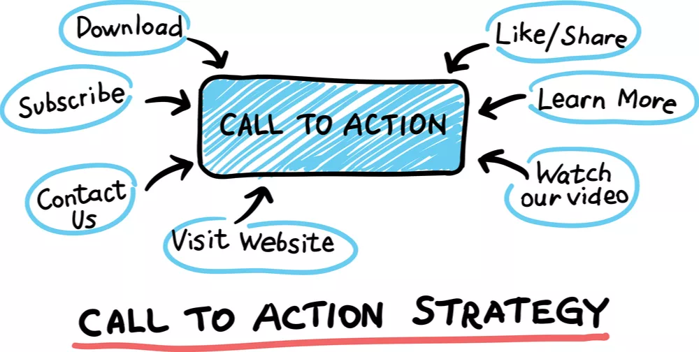
A Call-to-Action (CTA) refers to a specific element or statement used in marketing communications or on webpages to encourage and prompt users to take a desired action. It serves as a clear and actionable instruction that guides visitors towards a specific goal or conversion, such as making a purchase, signing up for a service, or downloading a resource. CTAs are typically designed to be visually prominent and employ persuasive language to engage and motivate users to take the intended action.
To optimize your Call-to-Action (CTA) for improved conversions, consider the following best practices:
- Use Clear and Actionable Language: Employ concise and straightforward language in your CTA that explicitly states the desired action. Choose words that inspire immediate response and clearly convey the benefits of taking that action.
- Ensure Prominence and Visibility: Make your CTA visually prominent on the page to capture attention. Utilize contrasting colors, larger font sizes, or distinctive button designs to make it easily noticeable. Position it strategically where it is visible without requiring users to scroll.
- Employ Compelling Design: Create visually appealing design elements that attract attention and encourage clicks. Experiment with various button shapes, colors, and styles to find what resonates best with your audience.
- Create a Sense of Urgency: Instill a sense of urgency or scarcity to motivate users to act promptly. Incorporate phrases like “Limited time offer” or “Only X left in stock” to create a fear of missing out.
- Highlight Clear Value Proposition: Communicate the value or benefit users will receive by clicking on the CTA. Emphasize what problem you can solve or what solution you offer to entice users to take action.
- Keep it Simple: Avoid cluttering your CTA with excessive text or unnecessary information. Keep it concise and focused, removing any distractions that may divert users’ attention from the desired action.
- Optimize for Mobile: Ensure your CTA is optimized for mobile devices, with a design that is easy to click and navigate on smaller screens. Adjust the size and placement of the CTA to accommodate mobile users.
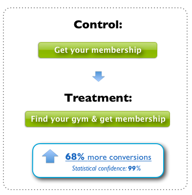
- Conduct A/B Testing: Test different variations of your CTA, including wording, design, color schemes, and placement, to identify the most effective configuration. Analyze the results and metrics to make data-driven decisions and optimize your CTAs accordingly.
- Maintain Consistency: Align your CTA with the overall messaging and content of the landing page. Make sure the CTA offers a natural continuation of the information presented, leading visitors seamlessly towards the desired action.
- Track and Analyze Performance: Implement tracking tools to monitor the performance of your CTAs. Measure metrics such as click-through rates, conversion rates, and bounce rates to evaluate the effectiveness of your CTAs and make informed improvements.
By adhering to these CTA best practices, you can optimize your CTAs for improved conversions, enhance user engagement, and achieve your desired goals.
How can I improve my CTA conversion?
- Use compelling and action-oriented language: Craft your CTA text with strong verbs and persuasive language that encourages immediate action. Clearly state the value or benefit users will gain by clicking on the CTA.
- Create a sense of urgency: Incorporate time-sensitive language or limited offers to create a sense of urgency and motivate users to take immediate action. Phrases like “Limited time offer” or “Act now” can instill a fear of missing out.
- Highlight specific value proposition: Clearly communicate the specific value or solution users will receive by clicking on your CTA. Emphasize what problem you solve or how your offering can address their needs.
- Design visually appealing CTAs: Use contrasting colors, prominent placement, and visually appealing design elements to make your CTA stand out on the page. Ensure it catches the user’s attention and is easy to identify.
- Simplify the CTA layout: Keep the design of your CTA simple and uncluttered. Remove any unnecessary distractions or elements that may divert attention away from the CTA itself.
- Optimize for mobile devices: Ensure your CTA is optimized for mobile users by using responsive design techniques. Make sure it is easily clickable and visible on smaller screens.
- Conduct A/B testing: Test different variations of your CTA, including colors, text, placement, and design elements. Analyze the results to determine which variations perform better and iterate based on the findings.
- Improve page load speed: Optimize the loading speed of your landing page to prevent users from getting frustrated and leaving before they even see or interact with the CTA. Optimize images, compress files, and use caching techniques to enhance page performance.
- Incorporate trust signals: Build trust and credibility by including trust badges, customer testimonials, reviews, or endorsements near your CTA. These elements can help alleviate concerns and increase conversion rates.
- Use directional cues: Guide users’ attention towards the CTA by incorporating visual cues such as arrows or images that direct their gaze towards the desired action. This can help draw focus and increase click-through rates.
Remember, continuous testing, data analysis, and making iterative improvements are crucial to optimize your CTA conversion rates. Monitor the performance of your CTAs and make data-driven decisions to refine and enhance your approach over time.
thanks,


Leave a Reply
You must be logged in to post a comment.