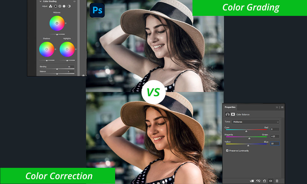
Color grading stands as a potent asset in the toolkit of every digital artist or photographer, facilitating the enhancement and metamorphosis of images by meticulously manipulating color tones and hues. Adobe Photoshop offers a plethora of tools and features to aid creators in attaining their envisioned color effects, spanning from nuanced tweaks to striking and theatrical transformations. In this blog, we’ll delve into fundamental color grading techniques in Photoshop, empowering you to harness the influence of color with assurance and ingenuity.
Embracing the Color Wheel:
Before delving into tools, let’s lay down a foundational understanding. Picture the color wheel as your guide, visually delineating the relationships between colors and aiding in the creation of harmonious or contrasting palettes. Familiarizing yourself with primary, secondary, and complementary colors empowers you to make informed decisions regarding your edits.

Within Photoshop lies a wealth of tools dedicated to color grading. Let’s delve into some essential ones:
Levels:

Fine-tune the overall brightness, contrast, and black/white points to establish a well-balanced foundation.
Curves:

Refine individual color channels to exert precise control over highlights, midtones, and shadows.
Selective Color:

Target specific color ranges to manipulate their hue, saturation, and lightness, ideal for enhancing particular elements within your image.
Color Balance:

Adjust the overall color temperature to imbue warm or cool tones, effectively setting the mood of your image.
Gradient Maps:

Incorporate subtle color overlays to introduce creative effects or split toning into your artwork.
Applying Your Knowledge:
Now, let’s put theory into practice:
- Start with a Neutral Base: Prior to implementing dramatic alterations, calibrate the white balance to establish a neutral starting point.
- Balance Highlights and Shadows: Utilize Levels or Curves to maintain appealing contrast while retaining intricate detail within your image.
- Emphasize or Subdue Colors: Employ Selective Color to intensify vibrant tones or tone down distracting colors within your composition.
- Set the Mood: Explore Color Balance to craft warm and inviting tones or evoke cool and melancholic atmospheres within your composition through experimentation.
- Refine with Subtlety: Exercise restraint and avoid excessive alterations. Often, subtle adjustments yield the most impactful results.
Additional Tips to Boost Your Confidence in Color Grading:
- Calibrate Your Monitor: Guarantee that your screen accurately depicts colors to facilitate true-to-life editing.
- Reference Real-Life Scenes: Draw inspiration from observing how light interacts with objects in the real world.
- Seek Inspiration: Peruse online portfolios or social media platforms to discover color grading styles that resonate with you.
- Practice Makes Progress: Explore diverse techniques and tools to cultivate your distinctive artistic style.
- Don’t Be Afraid to Experiment: In color grading, there are no rigid rules. Embrace the freedom to explore and articulate your vision.
Conclusion:
Color grading stands as a transformative and expressive art form, offering the opportunity to infuse your images with personality, mood, and atmosphere. Through mastering fundamental color grading techniques in Photoshop, you unlock the full breadth of your creativity, propelling your photography, artwork, and designs to unprecedented levels. Embrace the art of color grading, experiment with diverse techniques and effects, and allow your imagination to soar as you wield the vibrant palette of digital color.


Leave a Reply
You must be logged in to post a comment.